5 Mistakes to Avoid When Designing Brochures and Flyers for Small Businesses
In the digital age, brochures and flyers remain powerful tools for marketing small businesses. Despite the rise of online marketing, these printed or digital handouts serve as direct, tactile representations of your brand and provide an effective way to engage with potential customers. However, designing brochures and flyers isn’t as simple as putting information on a page. To make a lasting impression, your design must be both visually appealing and functional.
For small businesses working with limited budgets and resources, it’s crucial to avoid common design mistakes that could hurt your marketing efforts. In this blog, we’ll explore the five major mistakes to avoid when designing brochures and flyers and provide tips on how to create effective, high-impact marketing materials.
1. Overloading the Design with Too Much Information
One of the most common mistakes small businesses make is overloading brochures and flyers with too much information. While it’s tempting to include as many details as possible, especially if you’re promoting products or services, this can overwhelm readers and make your design feel cluttered. When a flyer or brochure is too text-heavy, it becomes difficult for the audience to focus on the key message.
How to Avoid This Mistake:
Prioritize Information: Identify the most critical points you want to convey and focus on those. For a brochure, this might include your company’s mission, a few standout products or services, and a call to action. A flyer can be even more focused, emphasizing a single message or promotion.
Use Bullet Points: Break up large chunks of text by using bullet points or short paragraphs to improve readability.
White Space is Your Friend: Don’t be afraid of white space—leaving empty space between elements makes the design feel clean and organized, and it helps guide the reader’s attention to what matters most.
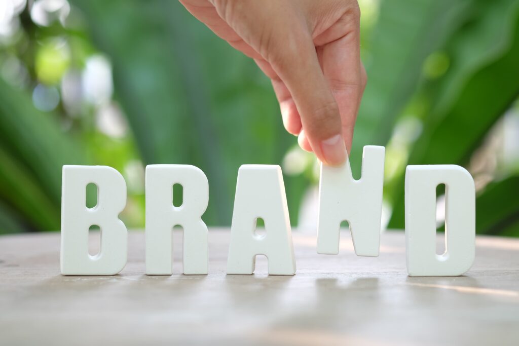
2. Ignoring Brand Consistency
Brand consistency is essential for small businesses trying to build recognition and trust. Many businesses make the mistake of creating brochures and flyers that don’t align with their established brand identity. If your marketing materials don’t match the colors, fonts, or overall style of your website, logo, or social media, it can confuse potential customers and weaken your brand image.
How to Avoid This Mistake:
Stick to Brand Guidelines: If your business has brand guidelines, always refer to them when designing marketing materials. This ensures that elements like logos, colors, and fonts are used consistently across all platforms.
Use Brand Colors and Fonts: Ensure that the colors and fonts used in your brochures and flyers align with your brand’s visual identity. Consistency in these elements builds familiarity and trust with your audience.
Create a Design Template: For future marketing campaigns, consider creating a template that includes your brand’s core design elements. This makes it easier to maintain consistency in every new brochure or flyer you create.
3. Poor Use of Images and Graphics
Images play a crucial role in the effectiveness of brochures and flyers, yet many small businesses either use low-quality images or choose visuals that don’t align with the message. Poorly chosen or pixelated images can make your design look unprofessional and distract from the key points you’re trying to communicate.
How to Avoid This Mistake:
Use High-Resolution Images: Always use high-quality, high-resolution images to avoid pixelation or blurriness, especially if you’re printing your materials. If you don’t have professional photos, there are many stock photo websites that offer affordable, high-resolution images.
Make Images Relevant: Choose images that directly relate to your message or product. For example, if you’re advertising a restaurant, use images of your actual dishes or venue, rather than generic food pictures.
Optimize for Print and Digital: Ensure that the images you use are optimized for both print and digital formats. Print materials require higher resolution, while digital flyers or brochures may need smaller file sizes to ensure fast load times.

4. Forgetting the Call-to-Action (CTA)
Another common mistake is neglecting to include a clear, compelling call-to-action. Your brochure or flyer should guide the reader to take the next step—whether that’s visiting your website, signing up for a service, or calling your business. Without a CTA, even the most beautiful and informative design may fail to convert potential customers into actual clients.
How to Avoid This Mistake:
Make the CTA Clear and Specific: Your CTA should be easy to understand and tell the reader exactly what to do next. For example, “Call Now for a Free Consultation” or “Visit Our Website for a Special Offer” are clear, actionable CTAs.
Highlight the CTA: Use design elements like bold fonts, contrasting colors, or larger buttons to make the CTA stand out. You want it to be easily noticeable without overpowering the rest of the design.
Limit to One or Two CTAs: Keep the focus on a single action, or at most two, to avoid confusing the reader. Too many CTAs can overwhelm and reduce the effectiveness of your message.
5. Skipping Proofreading and Quality Checks
Even if you’ve designed a visually stunning brochure or flyer, a single typo or error in the text can diminish its professionalism. Skipping proofreading or failing to check for print quality can lead to costly mistakes that affect your brand’s reputation and cause you to reprint or redesign your materials.
How to Avoid This Mistake:
Proofread Carefully: Double-check all the text for spelling, grammar, and punctuation errors. It’s helpful to have multiple people review the content to catch any mistakes you might miss.
Test for Print: Before printing a large batch of brochures or flyers, order a test print to ensure that the colors, images, and layout look as intended. Sometimes, colors that look good on screen may appear different in print, so testing beforehand can save you time and money.
Check Contact Information: Always verify that contact details like phone numbers, email addresses, and website links are correct. A simple mistake in the contact information can prevent potential customers from reaching you.

Frequently Asked Questions (FAQs)
A1: The size of your brochure or flyer depends on the type of content and the purpose. Standard sizes for brochures are typically A4 (8.5” x 11”) or A5 (5.8” x 8.3”). Flyers are often printed in sizes like A6 (4” x 6”) or A5. Consider your content and distribution method when choosing a size.
A2: While professional designers can help create high-quality, impactful materials, there are also affordable design tools (like Canva or Adobe Spark) that allow small businesses to create attractive designs on a budget. However, if your brand requires a polished, unique look, hiring a designer can be a worthwhile investment.
A3: It’s important to strike a balance. A flyer should have minimal text with one strong message or promotion, while a brochure can include more detailed information, but avoid overwhelming the reader. Stick to key points and use visuals to break up the text.
A4: Yes, many businesses create brochures and flyers that can be distributed both digitally and in print. Make sure your design is versatile and optimized for both formats. For example, use high-resolution images for print and ensure digital formats are compressed for faster online loading.
Conclusion
Brochures and flyers are highly effective marketing tools for small businesses, but only if they’re designed with care and precision. By avoiding these common mistakes—overloading with information, neglecting brand consistency, using poor-quality images, missing CTAs, and skipping proofreading—you can create materials that not only look professional but also drive results.
Remember, your brochures and flyers represent your business, so it’s essential to ensure that they are polished, visually appealing, and aligned with your brand identity. By focusing on clear, compelling messaging and high-quality design, you’ll be able to create marketing materials that attract, engage, and convert your target audience.