
Responsive Web Design: Why Your Business Needs It in 2024
In today’s fast-paced digital world, where mobile devices have taken over traditional desktop browsing, having a responsive website is no longer an option—it’s a necessity. Responsive web design (RWD) ensures that your website automatically adjusts its layout, images, and navigation to fit any screen size, from a desktop monitor to a mobile phone or tablet. As we head into 2024, the importance of responsive web design continues to grow, affecting everything from user experience to search engine optimization (SEO).
In this blog, we’ll explore the ins and outs of responsive web design, why your business needs it in 2024, and how it can give you a competitive edge in the digital landscape.
What is Responsive Web Design?
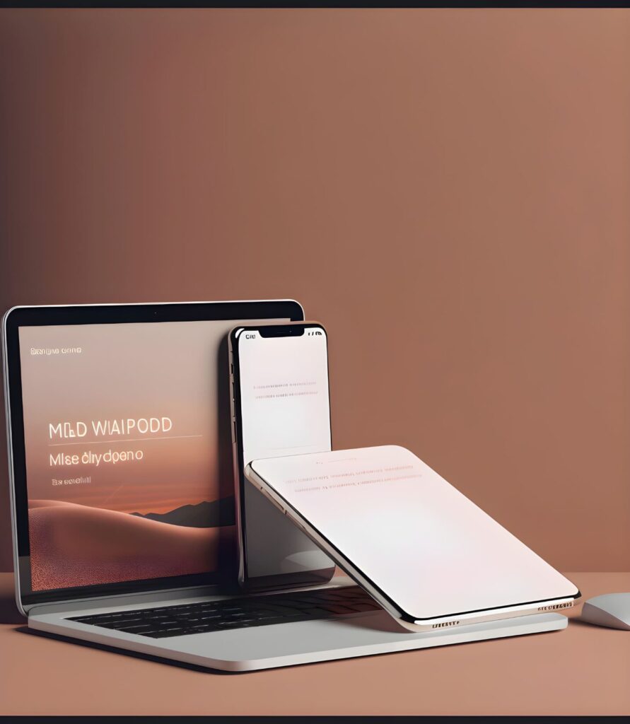
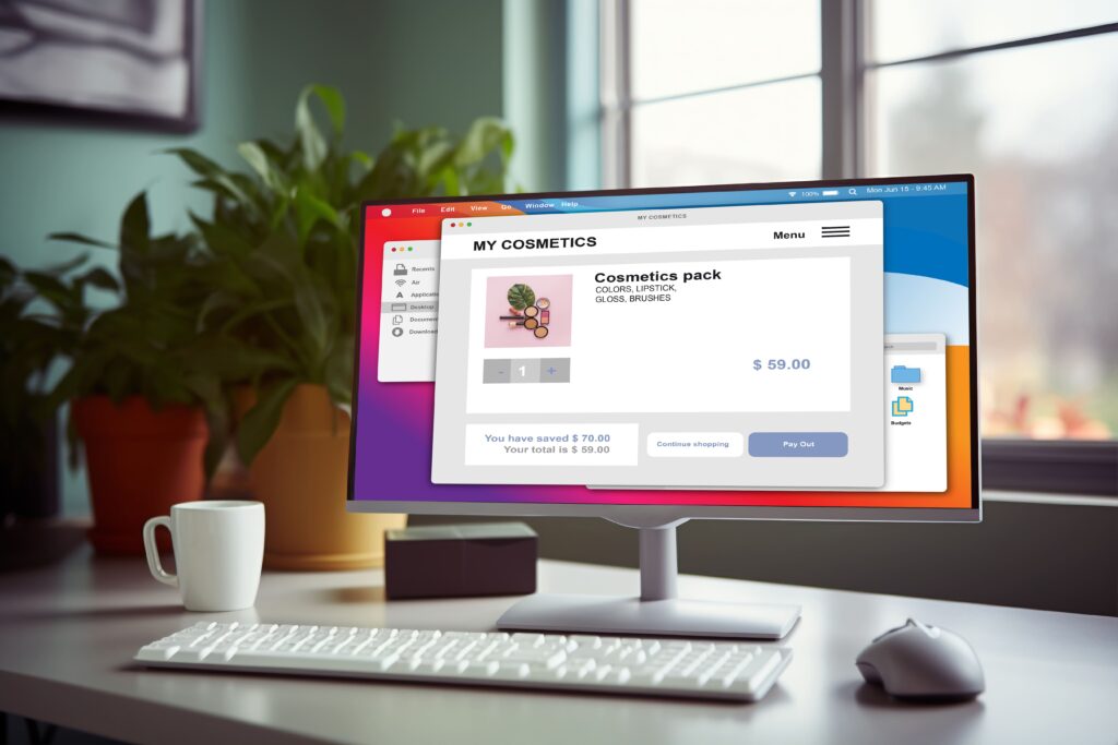
Responsive web design is a web development approach that ensures websites function smoothly across all device types and screen sizes. Rather than creating different versions of a website for desktops, tablets, and smartphones, a responsive website adapts its layout and content fluidly to fit any screen.
With RWD, there’s no need to worry about how your website looks on a mobile phone compared to a desktop; it automatically adjusts everything to deliver an optimized user experience (UX), regardless of the device being used.

Why Responsive Web Design Matters in 2024
1 .Mobile Usage Dominance
Mobile devices have officially overtaken desktop computers in terms of web traffic. In 2024, this trend is set to grow even further as consumers increasingly rely on their smartphones for browsing, shopping, and searching. If your website isn’t mobile-friendly, you risk losing a huge portion of your audience.
Statistics show that nearly 60% of all online traffic now comes from mobile devices. A non-responsive website can result in a poor user experience on mobile, leading to higher bounce rates and lower conversion rates.
2. Enhanced User Experience
User experience is a critical factor in determining a website’s success. Responsive web design allows users to easily navigate your site, regardless of the device they are using. A seamless experience—whether they are reading a blog post on their smartphone or purchasing a product on their desktop—means users are more likely to stay longer, explore more pages, and ultimately convert.
3. SEO Benefits
Google has made it clear: mobile-first indexing is the norm. This means that Google predominantly uses the mobile version of a website for indexing and ranking. If your site isn’t mobile-friendly, your SEO ranking could suffer, making it harder for potential customers to find you online.
Responsive design ensures that your website is optimized for mobile users, improving both your search engine rankings and the overall visibility of your website in search results.
4. Increased Conversion Rates
A responsive website doesn’t just look good; it helps improve your conversion rates. Whether a user is purchasing a product or signing up for a newsletter, a responsive site offers a smooth and user-friendly experience that makes completing actions easier.
When a visitor doesn’t have to pinch, zoom, or scroll horizontally to navigate your site, they’re more likely to stay engaged and take the desired action. A responsive design eliminates barriers to conversion and provides a frictionless experience, resulting in higher conversion rates.
5. Cost-Effective Development
In the past, businesses might have opted to create separate desktop and mobile versions of their websites. This is not only expensive but also time-consuming. With responsive design, you only need one version of your website, which adapts to various devices.
This means fewer development costs, easier maintenance, and faster updates, making responsive design a cost-effective solution for businesses of all sizes.
6. Faster Loading Times
A slow website can severely impact user experience and even cause you to lose customers. According to research, 53% of mobile users abandon a site that takes longer than 3 seconds to load. Responsive web design helps optimize your website’s performance on all devices, ensuring that it loads quickly no matter where or how it’s being viewed.
Responsive sites typically employ optimized images, streamlined coding, and other performance enhancements, all of which contribute to faster loading times. In 2024, when consumers expect instant gratification, speed is of the essence.
7. Improved Brand Perception
Your website is often the first interaction a potential customer has with your brand. A well-designed, responsive website creates a positive first impression and reflects well on your business. On the other hand, a poorly optimized, non-responsive website can make your business appear outdated or unprofessional.
By investing in responsive design, you ensure that users have a positive experience with your brand, no matter what device they’re using, helping to build trust and credibility.
Key Elements of Responsive Web Design
1. Fluid Grid Layouts Fluid grids ensure that the elements on your page resize in proportion to one another based on the screen size. This helps create a balanced and aesthetically pleasing design across different devices.
2. Flexible Images Responsive websites use images that can resize or scale down to fit smaller screens. This prevents oversized images from taking up too much space or slowing down load times on mobile devices.
3. Media Queries Media queries are a critical part of responsive design. They allow developers to apply different styles based on the device’s screen size, ensuring that the website looks and functions optimally across all devices.
4. Responsive Navigation Navigation menus should be easy to use on both large and small screens. Many responsive websites use collapsible or hamburger menus on mobile devices to simplify navigation and create a cleaner layout.
Frequently Asked Questions (FAQs)
Frequently Asked Questions (FAQs)
A1: You can easily check if your website is responsive by resizing your browser window. If the layout adjusts fluidly to fit different sizes or if the design remains user-friendly on mobile devices, your site is responsive. Alternatively, you can use tools like Google’s Mobile-Friendly Test to confirm.
A2: No, with responsive web design, you only need one website that works across all devices. This eliminates the need for separate desktop and mobile versions of your site, reducing both costs and maintenance.
A3: Yes, responsive websites are favored by Google due to mobile-first indexing. A mobile-friendly, fast-loading website with a great user experience can positively impact your SEO rankings.
A4: The cost of creating a responsive website varies depending on factors like complexity, design, and functionality. However, responsive design is generally more cost-effective in the long run compared to maintaining separate desktop and mobile
Conclusion: Why Your Business Needs Responsive Web Design in 2024
Whether you’re building a new site or updating an existing one, investing in responsive web design will ensure that your business is ready for the future. By creating a website that adapts to any device, you can reach a wider audience, improve your SEO, and provide an outstanding user experience that keeps customers coming back.